


A Timeless Primary Bathroom Renovation: French Provincial Charm, Modern Luxury & a Little Rule Breaking
A Fresh Take on a French Provincial Primary Bathroom

There are bathrooms you walk into and immediately think, "Well, everything has to go." And then there are bathrooms that aren't necessarily bad... they're just a little tired, a little dated, and somehow managing to feel half their actual size despite having plenty of square footage.
This bathroom fell into the second category.
Our clients live in a beautiful French Provincial home, and while they still loved many things about their primary bathroom, it was ready for a refresh. The room had wonderful natural light, a generous footprint, and a neutral color palette that actually worked beautifully with the rest of the house.
The problem? The finishes were dated, the layout felt unnecessarily crowded, and all that beautiful floor space wasn't exactly living up to its potential.
But we weren't interested in tearing everything apart just for the sake of starting over. Instead, we approached this bathroom renovation with a simple goal: create a softer, lighter, more refined version of what was already there. Something that respected the traditional design of the home while introducing clean lines, thoughtful details, and just enough modern style to make everything feel fresh.
We wanted timeless elegance without the formality, classic lines without the heaviness, and a seamless blend of traditional character and modern living.
And, of course, a healthy dose of polished nickel.
First, Let's Give This Bathroom Some Breathing Room
One of my favorite things about this bathroom renovation is that we didn't add a single square foot. Not one. We simply made much better use of the space we already had.
The original built-in tub occupied a substantial amount of visual real estate. A large wardrobe near the entrance interrupted the visual flow of the room, and the enclosed shower essentially created another wall inside an already generously sized bathroom.
Individually, none of these elements were necessarily terrible. Together? They were doing the room absolutely no favors.
We removed the bulky tub surround, relocated the wardrobe directly opposite the water closet, and opened up the shower.
Three changes. Completely different room.
Suddenly, your eye could travel through the space instead of stopping at a series of large, solid surfaces. This is something we think about constantly in interior design. Square footage only tells part of the story. How you experience that square footage is just as important.
Whether we're working with a small bathroom, a powder room, or a large primary suite, some of the most effective ways to make a space feel larger have nothing to do with actually making it larger.
In a small space, that might mean choosing a floating vanity, incorporating smart storage solutions, or using frameless glass shower enclosures to maintain open sight lines. In larger bathrooms, it might mean relocating tall cabinetry or replacing bulky shower surrounds with more open walk-in showers.
An accurate measurement tells us what fits. Good design tells us how to make it feel right. You don't always need a bigger room. Sometimes you just need to stop making the room you have feel smaller.
The Shower That Changed Everything
If there's one before-and-after that really tells the story of this bathroom remodel, it's the shower.
The original shower was dark, enclosed, and visually heavy. Between the tile borders, varying patterns, and solid enclosure, there was a lot happening, yet somehow the shower itself practically disappeared into the room.
Which is quite an accomplishment for something that takes up that much space. Opening it up changed everything.
By replacing the enclosure with frameless glass, we allowed natural light to travel throughout the bathroom. The shower became part of the overall design rather than a separate little room tucked inside it.
Of course, there's one small catch to making your shower completely visible. You now have to make sure it's worth looking at... Challenge accepted!
We chose a beautiful fluted tile for the shower walls. The subtle texture creates movement, catches the natural light, and adds architectural interest without overwhelming the room.
And that's one of my favorite ways to work with neutral palettes. Not every surface needs a bold pattern, dramatic color, or trend-led feature to be interesting. Sometimes a little dimension does far more than another decorative element ever could.
The shower floor introduces another layer of pattern, while the polished nickel fixtures from Signature Hardware bring just the right amount of shine against the softer materials. It's a wonderful example of how thoughtful material selections can have a huge impact on the overall design.
And while large-format tile and seamless shower surrounds are popular choices in contemporary bathrooms, smaller textured tiles can be equally beautiful when they're used intentionally. The fluted shower walls give this space personality without competing with the architecture. What was once one of the darkest, least interesting parts of the bathroom is now one of its most beautiful focal points.
Quite the glow-up, if you ask me.
The Case AGAINST the Matching Bathroom Set
Okay, this might be my favorite design lesson from the entire project.
When we started selecting plumbing fixtures with Signature Hardware, we didn't simply choose one collection and order everything from it. And that was very intentional.
You know those bedroom sets where the bed, dresser, chest, and nightstands all match perfectly? Same wood, same hardware, same everything?
We've been gently encouraging people to break up with those for years. And plumbing fixtures? They're no different. Just because a faucet and a showerhead belong to the same collection doesn't mean they're destined to spend eternity together. We approach each fixture individually.
What faucet felt right for the bathroom vanity? Which shower fixtures offered the detailing we wanted? What complemented the curves of the freestanding tub? Where did we want something more traditional, and where could we introduce the simplicity of modern minimalism?
Rather than limiting ourselves to one collection, we chose the pieces we genuinely loved from several Signature Hardware collections.
The common thread was polished nickel. Using the same finish throughout the plumbing fixtures created continuity, while the different silhouettes and details gave each area its own personality.
Same finish. Different collections. One beautifully cohesive bathroom.
And here's the thing: a room doesn't have to match perfectly to feel thoughtfully designed. Actually, I would argue it's often more interesting when it doesn't. The most successful bathroom designs reflect the homeowner's personal style rather than simply following current trends. We want a room to feel collected, layered, and personal. Not like someone clicked "add entire collection to cart."
It's chic to mix collections. Consider this your official permission slip.
And this isn't advice reserved for a complete renovation. Even if you're simply replacing a faucet or updating bathroom accessories, don't assume everything has to come from the same product family.
Look for pieces you love, pay attention to proportions and finishes, and let the room develop a little personality.

Let's Talk About That Freestanding Tub
Removing the original built-in tub gave us an opportunity to create an entirely different focal point. And what a difference it made.
The new freestanding tub from Signature Hardware has a beautiful, sculptural silhouette with soft curves and classic lines that feel perfectly at home in this French Provincial house. The pedestal base gives it a more traditional presence, which was particularly important to us.
A freestanding tub has become a popular choice in modern bathroom design, but that doesn't mean every freestanding tub belongs in every bathroom. A sleek soaking tub with simple geometric shapes might be absolutely stunning in a modern minimalist bathroom. Here? It would have felt a little like showing up to a black-tie event in sneakers.
Not necessarily wrong. Just not quite right for the occasion.
We wanted something with softness, elegance, and enough traditional character to feel as though it had always belonged in the home. This freestanding tub delivers all three. And while it has plenty of presence, it visually occupies far less space than the original built-in surround.
Paired with the polished nickel tub filler, it creates a beautiful little moment of luxury without feeling overly formal or precious. It's the kind of selection that gives a luxury bathroom its personality while still supporting the timeless design elements of the home.
Sometimes a single piece can completely change the way a room feels. This was definitely one of those moments.
Custom Cabinetry, Without All the Visual Weight
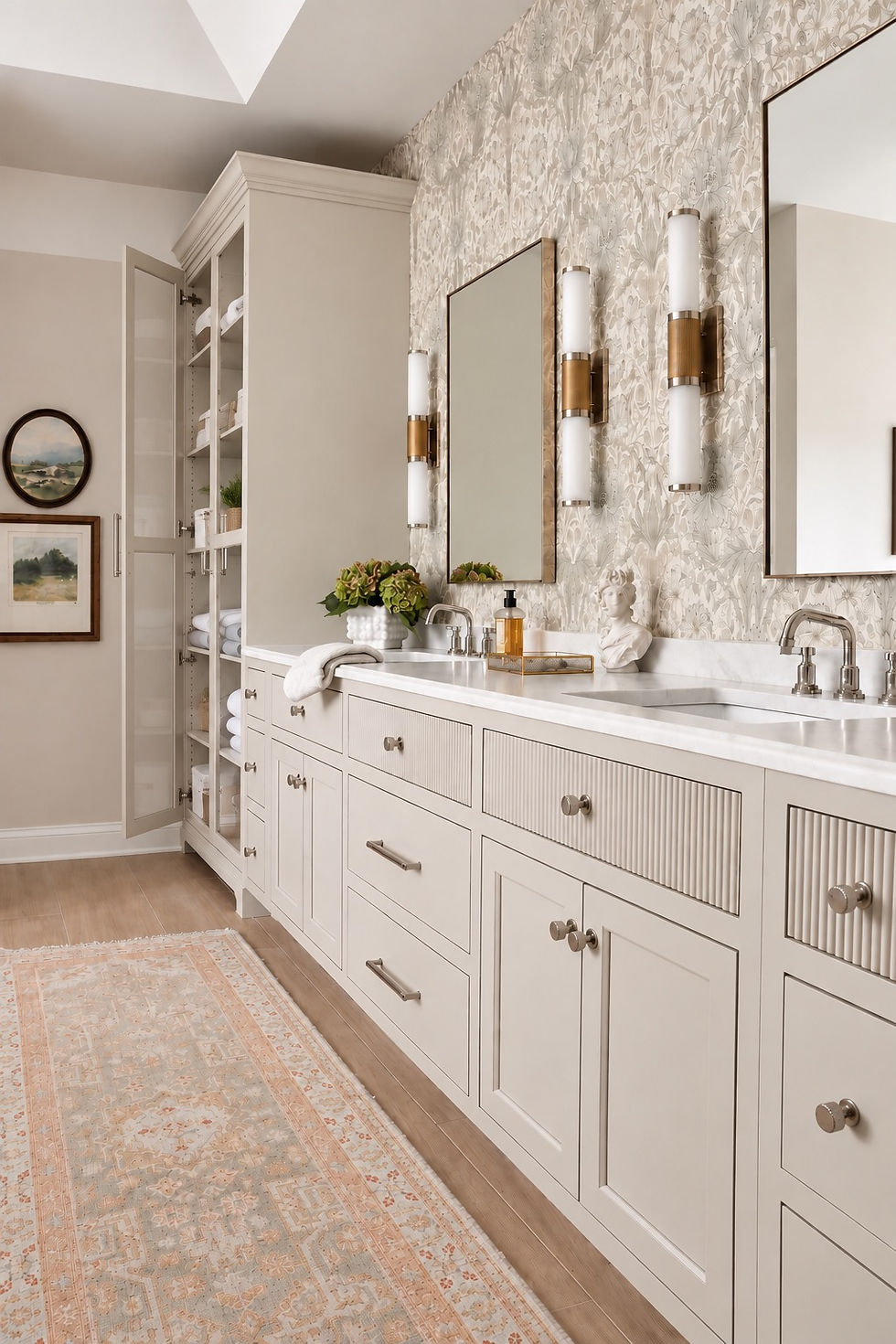
With such a long bathroom vanity, the cabinetry was always going to be a significant part of the design. The question was how to give it character without making it feel heavy. Enter fluting.
We introduced subtle fluted detailing into the custom cabinetry, giving the vanity a beautiful architectural quality without adding unnecessary ornamentation. And I particularly love how that texture quietly relates back to the fluted shower walls. It's not an exact match, and that's the point.
Good design is often about creating relationships between elements rather than repeating the same detail over and over again.
We paired the cabinetry with quartz countertops that have the softness and movement of natural stone, but with the durability needed for daily use. Now, listen. I love natural marble. Truly. But I also love a bathroom countertop that doesn't require a small emotional recovery every time someone spills something on it.
This is a primary bathroom. Toothpaste happens. Makeup happens. Skincare products happen. Someone is inevitably going to set down a hot styling tool. We wanted the beauty of natural stone without asking our clients to treat their bathroom like a museum.
Today's high-quality porcelain tiles, quartz surfaces, and other popular materials offer so many wonderful options for creating beautiful interiors that can stand up to a busy daily routine. And while natural materials will always have a place in our projects, practical alternatives can be equally beautiful when they're selected thoughtfully.
Because luxury should be lived in, not tiptoed around.
And Yes, We Mixed Metals Too
While we're on the subject of breaking up matching sets, let's address another design question that seems to make people unnecessarily nervous.
Can you mix metals in a bathroom? YES! In fact, please do!
Somewhere along the way, someone decided every metal finish in a room needed to match. I'd like to have a word with that person.
You can absolutely mix metals. You just need a little intention behind it.
In this bathroom, polished nickel is our dominant finish. You'll find it repeated throughout the Signature Hardware plumbing fixtures, creating a consistent foundation. But we didn't feel obligated to make every single light fixture match the faucets. The chandelier introduces another finish, while the two-toned wall lights help bridge the different metals together.
The result feels layered and collected rather than overly coordinated.
My general approach is to establish one dominant finish and then introduce secondary finishes in a few thoughtful places. That way, everything feels connected without looking like it came from one enormous matching set.
And no, your chandelier and faucet do not need to be best friends. They just need to get along.
Good Bathroom Lighting Is Not a One-Fixture Situation
We were fortunate to start with wonderful natural light in this bathroom, and opening up the shower allowed us to take even better advantage of it.
But natural light is only part of the equation.
A bathroom still has to function at 6:30 in the morning, after dark, and during the middle of a Chicago winter when the sun has apparently decided to take an extended vacation. That's where layered artificial light comes in.
Vanity lighting serves a very different purpose than overhead lighting, while decorative lighting fixtures can add an entirely different level of personality to the room. We wanted lighting that was functional, flattering, and appropriate for the architecture of the home.
There are plenty of gorgeous contemporary bathrooms featuring an LED-backlit mirror, crisp white finishes, and minimalist design. We love those too... but they weren't right for this house.
Instead, we selected decorative lighting with more traditional character, giving the room warmth and elegance while reinforcing the overall design direction.
And that's really the lesson here. Just because something is trending on social media doesn't mean it belongs in your home. Fast-moving bathroom trends and design trend reports can be wonderful sources of inspiration, but they shouldn't dictate every decision.
Design for the room you're creating, not the room you saw on Instagram yesterday.

Neutral Doesn't Mean No Personality
I think the word "neutral" sometimes gets unfairly translated into "white." Or beige. Or boring. And I would like to respectfully disagree with all three.
This bathroom is undeniably neutral, but look a little closer and you'll find warm beiges, soft creams, subtle stone tones, polished nickel, textured tile, fluted cabinetry, and several different levels of sheen.
There's actually quite a lot happening, but it's just not all shouting for attention. And that's the beauty of a well-developed neutral color palette. Instead of relying on bold color to create interest, we use material, texture, shape, and contrast.
Fluted tile beside a smooth countertop. Reflective polished nickel against softer finishes. Subtle movement in the stone paired with more tailored cabinetry. Even something as simple as placing a honed finish beside a polished surface can create visual depth. Each element brings something different to the room.
The result feels layered and sophisticated without being busy.
And because the larger elements are relatively quiet, the room has room to evolve. Towels can change. Accessories can change. Art can change. Even paint can change without requiring another full-scale renovation. Neutral color schemes also provide a wonderful foundation for introducing new colors, earthy tones, or warm wood tones as a homeowner's tastes evolve.
That's one of the reasons we love working with soft neutrals. They allow the architecture and materials to shine while giving a room the flexibility to change over time. Which is lovely, because ideally, we'd like our clients to enjoy their bathrooms for quite a few years before inviting us back to tear them apart again.
Not Ready for a Full Bathroom Renovation? Start Here.
Here's the good news.
You don't have to take your bathroom down to the studs to borrow some of these ideas. Sometimes a room feels dated because of one or two elements that are having a much bigger impact than they deserve. Maybe it's the lighting. Maybe it's the mirror. Maybe it's a very specific metal finish that was apparently required by law in every bathroom built during a certain decade.
Whatever it is, start there.
A few simple upgrades, like replacing a dated faucet, introducing more interesting lighting, or updating cabinet hardware, can make a surprisingly big difference. If the room feels cold, consider warmer neutrals, natural textures, or warm wood tones. If it feels crowded, look at what's interrupting your sight lines. A bulky cabinet, an oversized vanity, or an enclosed shower might be making the room feel smaller than it actually is. For compact spaces, a floating vanity, frameless glass, and thoughtful storage can create a more open feeling without sacrificing function. And if you're selecting new plumbing fixtures, remember our little conversation about matching collections.
You have options!
Tile is another place where small decisions can have a significant impact. Size, texture, layout, and even grout color can completely change the feeling of a space. Large-format porcelain tile can create a quieter, more expansive look with fewer grout lines, while smaller tiles can introduce pattern and personality exactly where you want them. Larger tiles can be particularly effective in a smaller space, but don't overlook texture or the way different materials interact. Even classic white tiles can feel completely different depending on their finish, proportions, and installation pattern.
The point is, you don't always need more.
Sometimes you just need to be a little more intentional with what you already have. And if you're planning a bathroom remodel, my best expert advice is to think about how you want the room to function before you start falling in love with finishes. Pretty is wonderful. Pretty that works is even better.
Designing for the House You Actually Have
Of all the decisions we made throughout this renovation, this might be the one I'm most passionate about. We weren't trying to turn a French Provincial home into a modern minimalist house. And why would we? The architecture already had a beautiful story to tell. Our job was to make sure the bathroom felt like part of that story rather than a completely separate chapter.
We borrowed the things we loved about modern design: openness, clean lines, improved function, and visual simplicity. Then we layered those ideas with the traditional silhouettes, classic detailing, soft neutrals, and architectural character that belonged in this home. The result is a seamless blend of traditional design and contemporary design, without feeling like either style is competing for attention.
This is what timeless bathroom design means to us.
Not avoiding every trend or refusing to introduce modern materials, but understanding which elements will still feel appropriate and beautiful years from now. A successful bathroom renovation should respond to the architecture, the homeowners, and the way the space is actually used. The finished bathroom feels dramatically different from the original. Lighter. More open. More refined. But it doesn't feel disconnected from the rest of the house.
And that's always the goal. I never want someone to walk into a newly renovated room and wonder if they accidentally wandered into a different house. A successful renovation should feel like the best possible version of what was meant to be there all along.
It's the Details That Make It Personal
When you look at the finished bathroom, there isn't one single selection responsible for the transformation. It's the way everything works together.
The freestanding tub from Signature Hardware introduced a beautiful new focal point. The frameless shower changed the way natural light travels through the room. The fluted tile and cabinetry added subtle architectural texture. The quartz countertops brought beauty and practicality together. The lighting introduced warmth and personality.
And the thoughtfully mixed Signature Hardware fixtures gave us something I think is essential to good interior design: individuality.
None of those fixtures needed to come from the same collection. The metals didn't all need to match. The materials didn't need to be identical. They simply needed to have a relationship with one another.
Because the best interiors aren't necessarily the ones where everything matches perfectly. They're the ones where everything feels like it belongs. And now, instead of a bathroom that simply functions within this beautiful French Provincial home, we have a space that feels like a natural extension of it. Only lighter, brighter, more functional, and considerably more enjoyable to spend time in. Which, when you think about how much time we all spend in our bathrooms, seems like a pretty worthwhile investment.
As always, if you are ready to move forward with your bathroom renovation, we would absolutely love to bring your vision to life and truly customize a space that is perfect for you.
SHOP all of the beautiful Signature Hardware fixtures found in this bathroom here.
*This bathroom renovation was completed in partnership with Signature Hardware. As always, our design decisions and opinions are entirely our own.


Comments