Studies Show How Color Can Really Change Your Mood: How To Use Color In Your Home
- May 30, 2023
- 6 min read
The correlation between color and mood is a fascinating subject that has been studied for many years. The study of the psychology of colors has shown that colors have the ability to affect our emotions, behavior, and overall well-being. Understanding this correlation between color and our well-being can help us create environments that promote positive moods and emotions.

Studies have shown that colors can have a significant impact on not only our mood and emotions but also our energy levels. Different colors can evoke different feelings and can greatly affect our mental and physical well-being. This is why it is important to carefully consider the colors we use in our homes, which is where we spend a significant amount of our time.
Warm Vs Cool
Colors can be broadly categorized into warm and cool colors. Each color comes in an array of different shades. Neutral colors with slight undertones can be a great choice for wall colors when you don't want to make a big color commitment. Interior designers and color specials have a trained eye and can help you pick out those undertones if that is not your strong suit.
Even white rooms have undertones and also have the ability to add color combinations which will make the room feel relaxing or invigorating depending on the complementary colors you choose. Adding an accent color through decor, artwork and textiles can be a great way to evoke positive emotions without being overwhelming.
Cool Colors
Cool colors are associated with calmness, relaxation, and tranquility. Colors such as blue, green, and purple can reduce stress and anxiety and promote a sense of peace. This is why they are often used in areas such as bedrooms, meditation rooms, and spas. Often times we hear that this makes it a great choice for bedrooms or areas where you want to promote a sense of tranquility. But have you ever heard that blue is a great color for a home office?

A home office can be a place of great stress and using a blue toned paint color can be an excellent choice in a room where you'd like to enhance the calming effect and create a relaxing vibe. Having a blue room can also have a profound effect on focus and concentration. This shade can help you to stay on task and avoid distractions, allowing you to be more productive. Darker shades of blue also help to create a professional atmosphere and are popular for professional settings such as law firms and financial institutions. If you often find your self on camera in your home office in Zoom meetings and want to evoke a professional feel, you may want to consider navy as your background.
Green is another calming color that can promote a sense of balance and harmony. It is also associated with nature, making it a great choice for spaces that need a touch of the outdoors such as a home office or study room. I find every room needs a bit of green whether that is in accent pieces or actual live greenery. Bringing the outdoors in always brings a much needed sense of harmony and calmness to every space.
Warm Colors
Warm colors , on the other hand, such as red, orange, and yellow are associated with excitement, energy, and warmth. These colors can increase heart rate and blood pressure and can create a sense of urgency or excitement. This is why they are often used in areas where physical activity is encouraged such as gyms or sports arenas. In the home these colors are great for playrooms to encourage kids' play.
More subtle shades of varying hues are often also associated with warmth and coziness. They often provide a welcoming atmosphere. This makes warm colors a great choice for your living room and dining room or even a bedroom. Painting your room a subtle shade that has undertones of warmth, adding in decor and accessories and balancing them with cool colors can be great ways to evoke the feeling of warmth without feeling too dated. Large rooms also benefit from having warm tones. While cool tones are said to push you away and expand a room, warm tones envelop you making a large room feel cozier.
Warm colors can often be considered to be a bit more bold. The color red, for example, is known to increase heart rate and blood pressure, making it a good choice for areas where physical activity is encouraged. It can also create a feeling of warmth and excitement, making it a great choice for social areas such as the living room or dining room. Yellow is a cheerful color that can promote happiness and optimism, making it a great choice for areas where you want to create a positive atmosphere such as a kitchen or playroom.

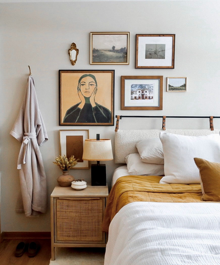
I love using warm tones in bathrooms and bedrooms. Unlike their primary color counterparts, pinks, peaches and ochres are perfect backdrops for every skin tone. Have you ever been in someone's bathroom and asked yourself why your skin looks so bad?! It may be because the room is painted a cool color. Generally many green and yellow tones can leave you looking pale and sickly. Regardless of your skin tone, using a color with a pink or peach undertone will make your skin look its' best. Soft beiges or warm tans are great alternatives too.
Brown is having a moment
My current favorite warm color that is having its own moment right now is brown. Brown is a warm and earthy color that creates a cozy and comfortable atmosphere. It is also said to create a sense of stability and can be quite grounding. Different than its warm counterparts, brown actually has similar effects to cool colors in that it helps to promote relaxation. It is a soothing color that encourages rest and is perfect for anywhere in your home where you would like to welcome rest and relaxation. I love using brown tones in all of the usual places you may think of when promoting feelings of warmth such as the living room and bedroom but one room of the house where I think brown really can be utilized well is the dining room. There is nothing better than a cozy dining room. Brown can be the perfect backdrop to a candlelit dinner party that goes on for hours.
How to find the right color
When beginning your color search, try not to focus on the primary colors. They will often be too intense and will steer you away from the entire color family. Instead, come up with a more subtle color palette which has lighter shades with complementing dark colors. Remember, creating a color palette is not the same thing as creating a paint schedule. These are the colors that you will be using even if you have all white walls. Your palette will help direct your art choices and decor pieces for each room.
Consider your light
Always always always bring your color swatches home. Bring several of each color. Put them up on all of your walls in the space and see how natural light effects the color at different times of the day. I often use Samplize to get larger samples which helps tremendously. They're large enough for you to actually see the color and they are printed on paint friendly stickers that don't damage the walls. Here's a link for you to check them out.
Consider hue and depth of color
Even if your color preferences lean towards cool colors, it is important to balance that with some warmth throughout your space. Try playing with different shades and hues. Darker colors can feel more rich and grounding then bright colors in the same color. Pastel blues may have bring on negative emotions while you navy blues do the opposite for you. In general, softer shades are a great option for your main color scheme allowing you to enjoy the effects of color without a specific color being too overwhelming or bold.

When using color in your home, it is important to consider the overall mood and atmosphere you want to create. You can use a combination of colors to create a balanced and harmonious space. For example, you can use a combination of blue and green to create a calming and relaxing atmosphere in your bedroom. You can also use pops of color such as red or yellow to add interest and energy to a space.
Color plays an important role in our mood and emotions. By carefully considering the colors you use in your home, you can create a space that promotes relaxation, happiness, and positivity. A well-designed home can have a positive impact on your mental and physical well-being, making it a worthwhile investment.


Hi Laura & Ryan,
Thank you for sending your news letter to me - its fantastic! I really enjoyed going through it, so well done.